This chapter shows how to access the different metrics and analytics that Axoflow collects about your security data pipeline.
This is the multi-page printable view of this section. Click here to print.
Metrics and analytics
- 1: Analytics
- 2: Host metrics
- 3: Flow analytics
- 4: Flow metrics
1 - Analytics
Axoflow allows you to analyze your data at various points in your pipeline using using Sankey, Sunburst, and Histogram diagrams.
- The Analytics page of allows you to analyze the data throughput of your pipeline.
- You can analyze the throughput of a flow on the Flows > <flow-to-analyze> > Analytics page.
- You can analyze the throughput of a single host on the Hosts > <host-to-analyze> > Analytics page.
The analytics charts
You can select what is displayed and how using the top bar and the Filter labels bar. Use the top bar to select the dataset you want to work with, and the Filter labels bar to select the labels to visualize for the selected dataset.
-
Time period: Select the icon to change the time period that’s displayed on the charts. You can use absolute (calendar) time, or relative time (for example, the last 2 days).
Axoflow stores all dates in Coordinated Universal Time (UTC), and automatically converts it to the timezone of set in your browser/operating system.
-
Select to switch between Sankey, Sunburst, and Histogram diagrams.
-
You can display the data throughput based on:
- Output bytes
- Output events
- Input bytes
- Input events
-
Export as CSV: Select to download the currently visible dataset as a CSV file to process it in an external tool.
-
Add and clear filters ( / ).
-
Free Text mode searches in the values of the labels that are selected for display in the Filter labels bar, and filters the dataset to the matching data. For example, if the Host and App labels are displayed, and you enter a search keyword in Free Text mode, only those data will be visualized where the search keyword appears in its hostname or the app name.
-
AQL mode allows you to search in any available labels. It also makes more complex filtering possible, using the Equal, Contains, and Match operators. When using AQL mode, Axoflow Console autocompletes the available labels as well as their most frequent values.
Tip: to delete an AQL block, use SHIFT+Backspace. You can quickly navigate between the blocks using Tab and SHIFT+Tab.
The Filter labels bar determines which labels are displayed. You can:
-
Reorder the labels to adjust the diagram. On Sunburst diagrams, the left-most label is on the inside of the diagram.
-
Add new labels to get more details about the data flow.
- Labels added to AxoRouter hosts get the
axo_host_prefix. - Labels added to data sources get the
host_prefix. For example, if you add a rack label to an edge host, it’ll be added to the data received from the host ashost_rack.
On other pages, like the Host Overview page, the labels are displayed without the prefixes.
- Labels added to AxoRouter hosts get the
-
Remove unneeded labels from the diagram.
Click a segment of the diagram to drill-down into the data. That’s equivalent with selecting and adding the label to the Analytics filters. To clear the filters, select .
Hover over a segment displays more details about it.
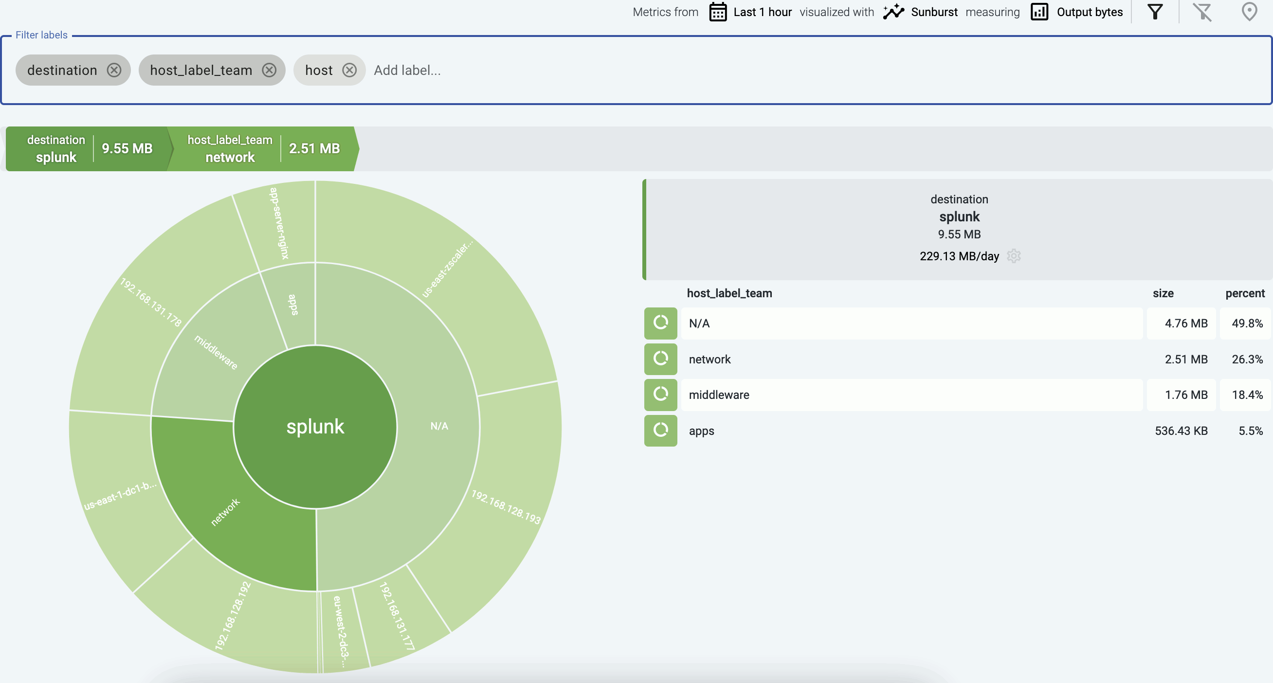
Sunburst diagrams
Sunburst diagrams (also known as ring charts or radial treemaps) visualize your data pipeline as a hierarchical dataset. It organizes the data according to the labels displayed in the Filter labels field into concentric rings, where each ring corresponds to a level in the hierarchy. The left-most label is on the inside of the diagram.
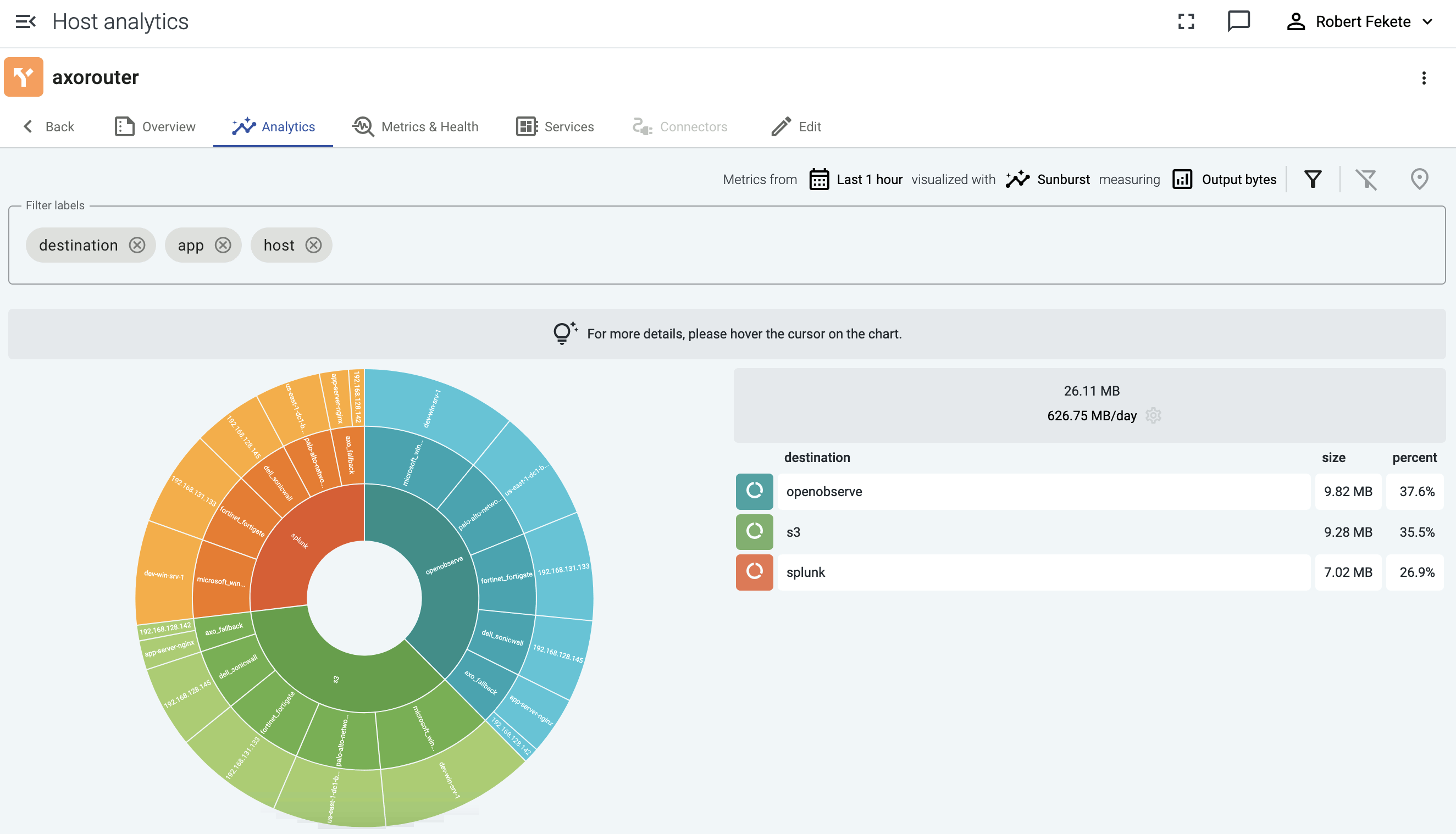
For example, sunburst diagrams are great for visualizing:
- top talkers (the data sources that are sending the most data), or
- if you’ve added custom labels that show the owner to your data sources, you can see which team is sending the most data to the destination.
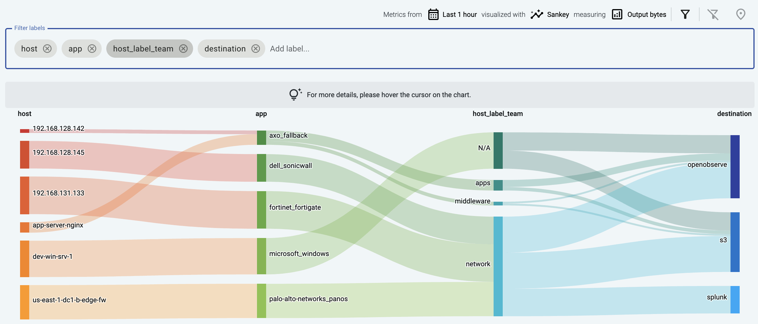
The following example groups the data sources that send data into a Splunk destination based on their custom host_label_team labels.
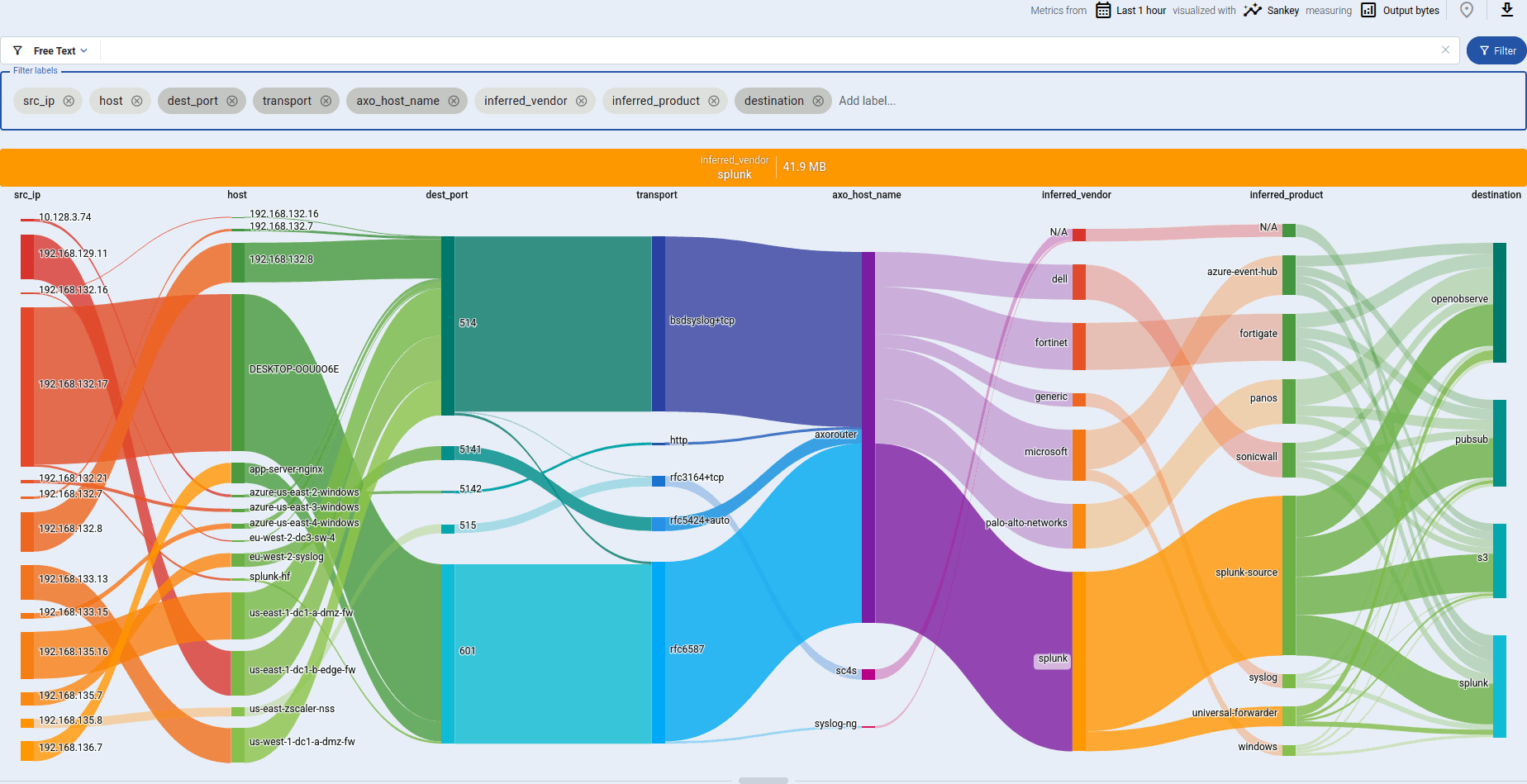
Sankey diagrams
The Sankey diagram of your data pipeline shows the flow of data between the elements of the pipeline, for example, from the source (host) to the destination. Sankey diagrams are especially suited to visualize the flow of data, and show how that flow is subdivided at each stage. That way, they help highlight bottlenecks, and show where and how much data is flowing.
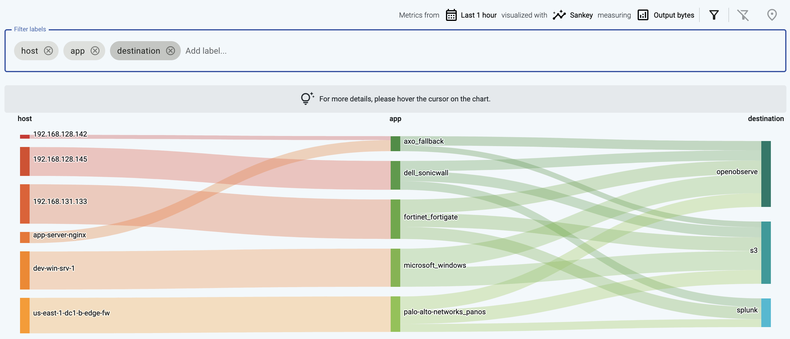
The diagram consists of nodes (also called segments) that represent the different attributes or labels of the data flowing through the host. Nodes are shown as labeled columns, for example, the sender application (app), or a host. The thickness of the links between the nodes of the diagram shows the amount of data.
-
Hover over a link to show the data throughput of this link between the edges of the diagram.
-
Click on a link to:
- Show the details of the link: the labels that the link connects, and their data throughput.
- Tap into the log flow.
- Open a Histogram.
-
Click on a node to drill-down into the diagram. (To undo, use the Back button of your browser, or the clear filters icon .)
The following example shows a custom label that shows the owner of the source host, thereby visualizing which team is sending the most data to the destination.
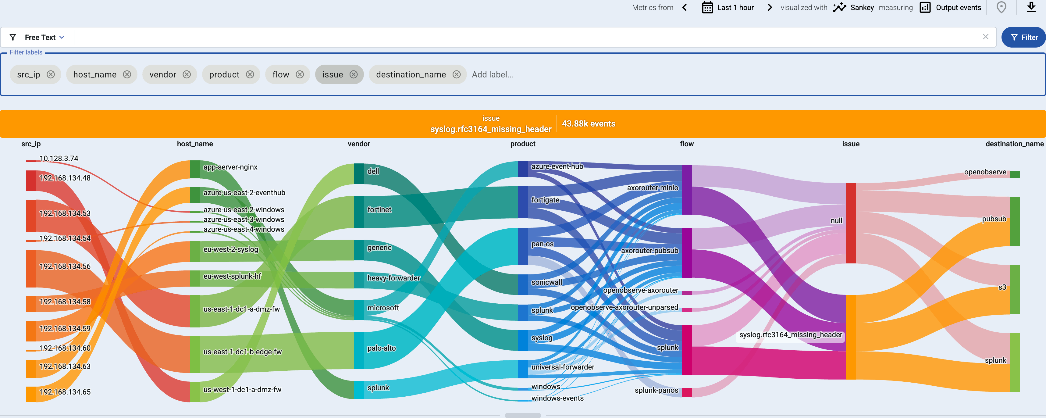
This example shows the issue label that marks messages that were invalid or malformed for some reason (for example, the header of a syslog message was missing).
Sankey diagrams are a great way to:
- Visualize flows: add the
flowlabel to the Filter labels field. - Find unclassified messages that weren’t recognized by the Axoflow database: add the
applabel to the Filter labels field, and look for theaxo_fallbacklink. You can tap into the log flow to check these messages. Feel free to send us sample so we can add them to the classification database. - Visualize custom labels and their relation to data flows.
Histogram
The Histogram chart shows time-series data about the metrics for the selected labels.
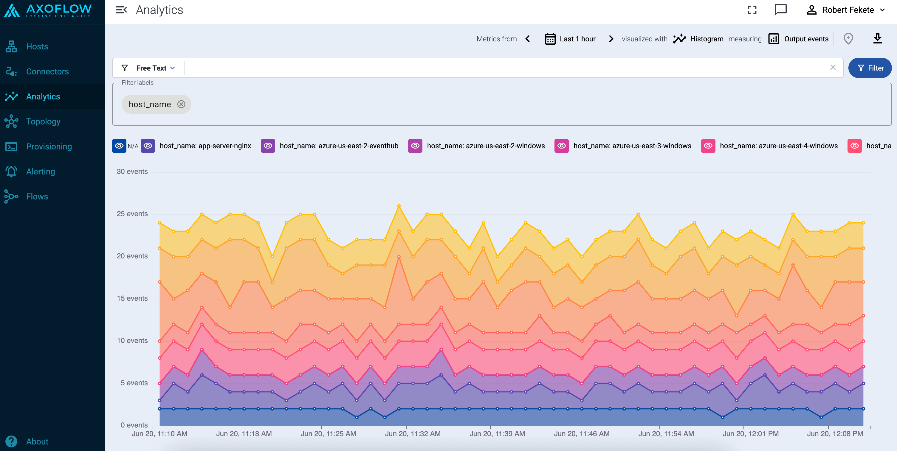
Note that:
- Hovering over a part of the chart shows you the actual metrics for that time.
- Exporting as CSV ( ) download the currently visible dataset as time-series data.
- Adding too many labels to the Filter labels field can make the chart difficult to interpret.
You can also access histogram charts from the tapping dialog of the Sankey diagrams when you click on a link in the diagram: Histogram for full column will create a histogram for the entire Sankey column, while Histogram for this value will shot the histogram for the selected link.
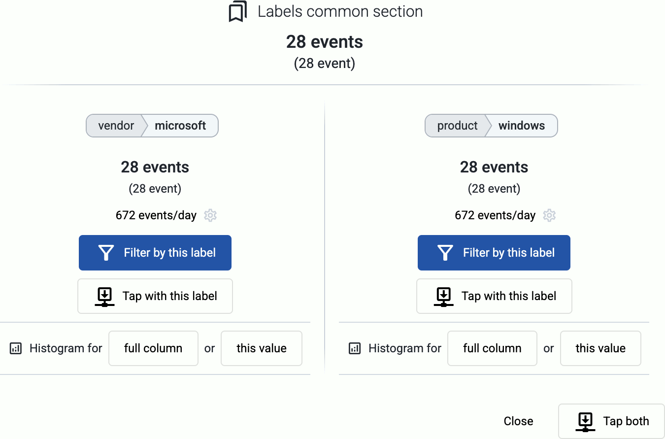
Tapping into the log flow
-
On the Sankey diagram, click on a link to show the details of the link.
-
Tap into the data traffic:
- Select Tap with this label to tap into the log flow at either end of the link.
- Select Tap both to tap into the data flowing through the link.
-
Select the host where you want to tap into the logs.
-
Select Start.
-
When the logs you’re interested in show up, click Stop Log Tap, then click a log message to see its details.
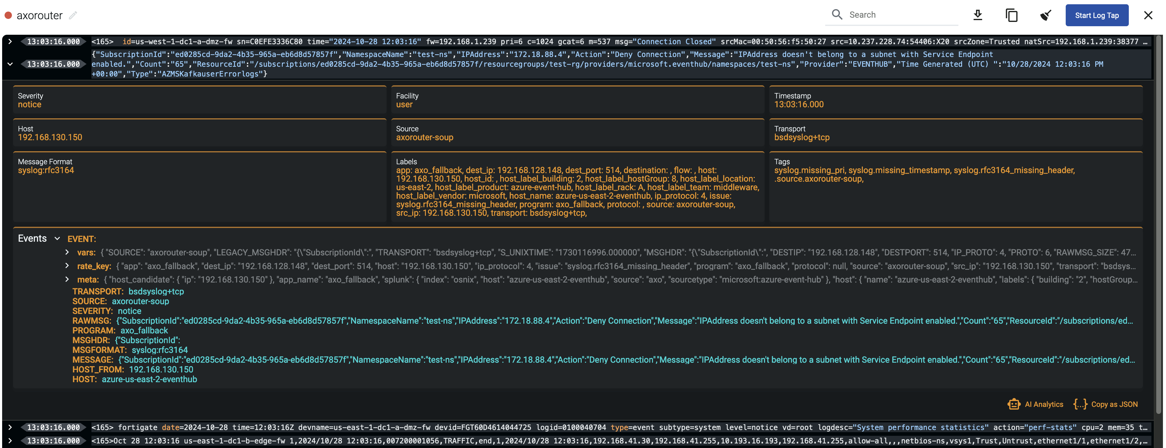
-
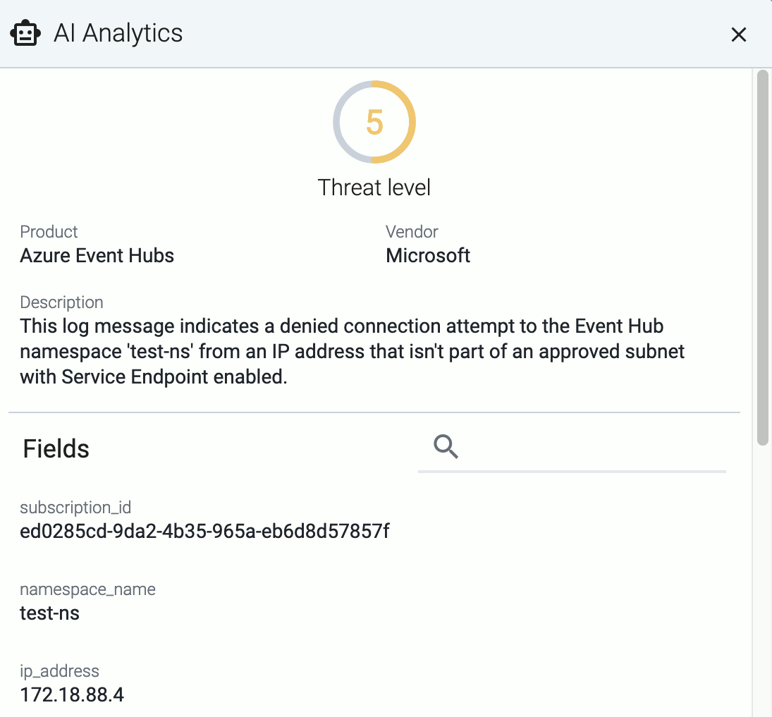
If you don’t know what the message means, select AI Analytics to ask our AI to interpret it.
2 - Host metrics
The Metrics & health page of a host shows the history of the various metrics Axoflow collects about the host.
Events of the hosts (for example, configuration reloads, or alerts affecting the host) are displayed over the metrics.
Interact with metrics
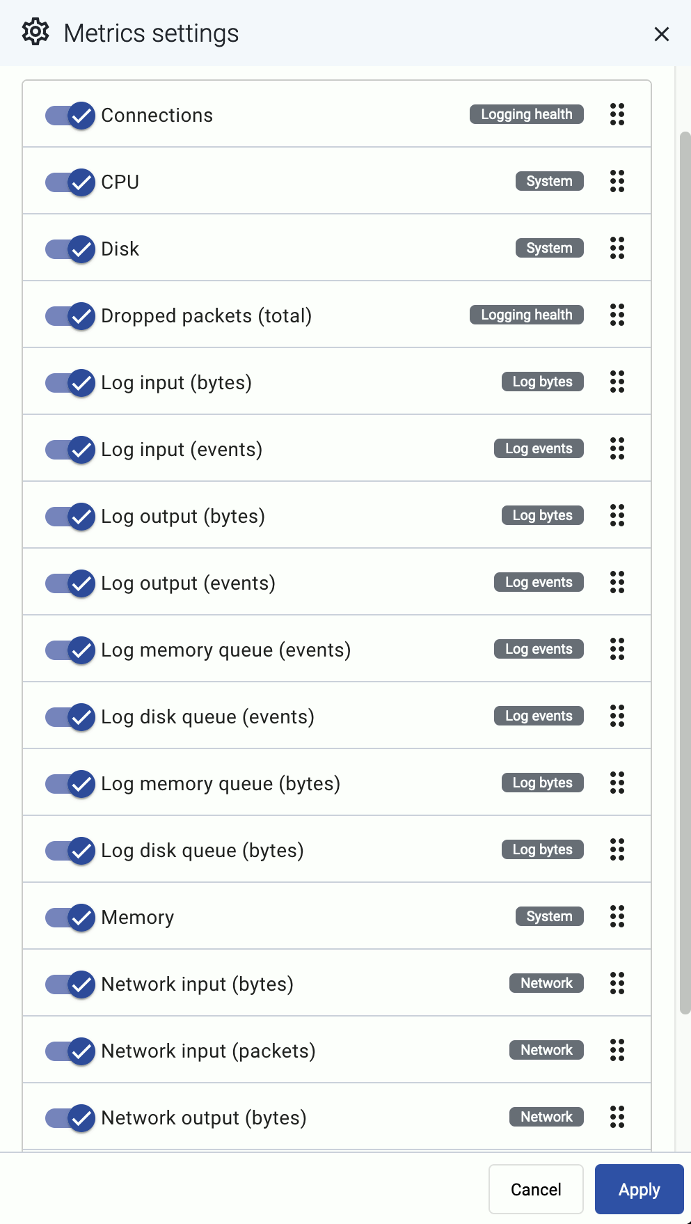
You can change which metrics are displayed and for which time period using the bar above the metrics.

-
Metrics categories: Temporarily hide/show the metrics of that category, for example, System. The category for each metric is displayed under the name of the chart. Note that this change is just temporary: if you want to change the layout of the metrics, use the icon.
-
: Use the calendar icon to change the time period that’s displayed on the charts. You can use absolute (calendar) time, or relative time (for example, the last 2 days).
Axoflow stores all dates in Coordinated Universal Time (UTC), and automatically converts it to the timezone of set in your browser/operating system.
To quickly zoom in on a period, click and drag to select the period to display on any of the charts. Every chart will be updated for the selected period. (To return to the previous state, click the Back button of your browser.)
-
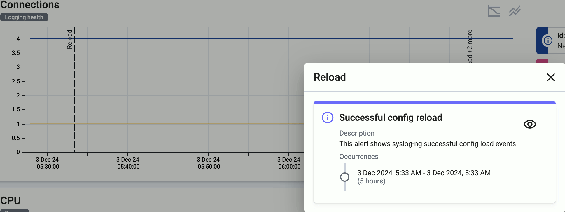
/ : Hide/show the alerts and other events (like configuration reloads) of the host. These event are overlayed on the charts by default.
-
: Shows the number of active alerts on the host for that period.
-
The allows you to change the order of the metrics, or to hide metrics. These changes are persistent and stored in your profile.
Interact with a chart
In addition to the possibilities of the top bar, you can interact with the charts the following way:
-
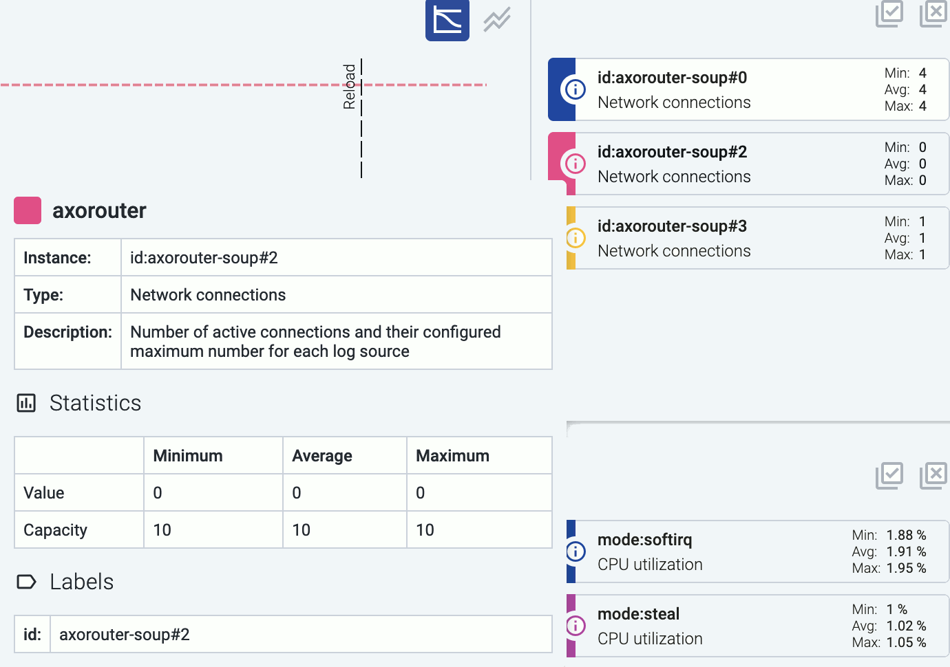
Hover on the icon on a colored metric card to display the definition, details, and statistics of the metric.
-
Click on a colored card to hide the related metric from the chart. For example, you can hide unneeded sources on the Log input charts.
-
Click on an event (for example, an alert or configuration reload) to show its details.
-
To quickly zoom in on a period, click and drag to select the period to display on any of the charts. Every chart will be updated for the selected period. (To return to the previous state, click the Back button of your browser.)
Metrics reference
For managed hosts, the following metrics are available:
-
Connections: Number of active connections and the maximum permitted number of connections for each connector.
-
CPU: Percentage of time a CPU core spent on average in a non-idle state within a window of 5 minutes.
-
Disk: Effective storage space used and available on each device (an overlap may exist between devices identified).
-
Dropped packets (total): This chart shows different metrics for packet loss:
- Dropped UDP packets: Number of UDP packets dropped by the OS before processing per second averaged within a time window of 5 minutes.
- Dropped log events: Number of events dropped from event queues within a time window of 5 minutes.
-
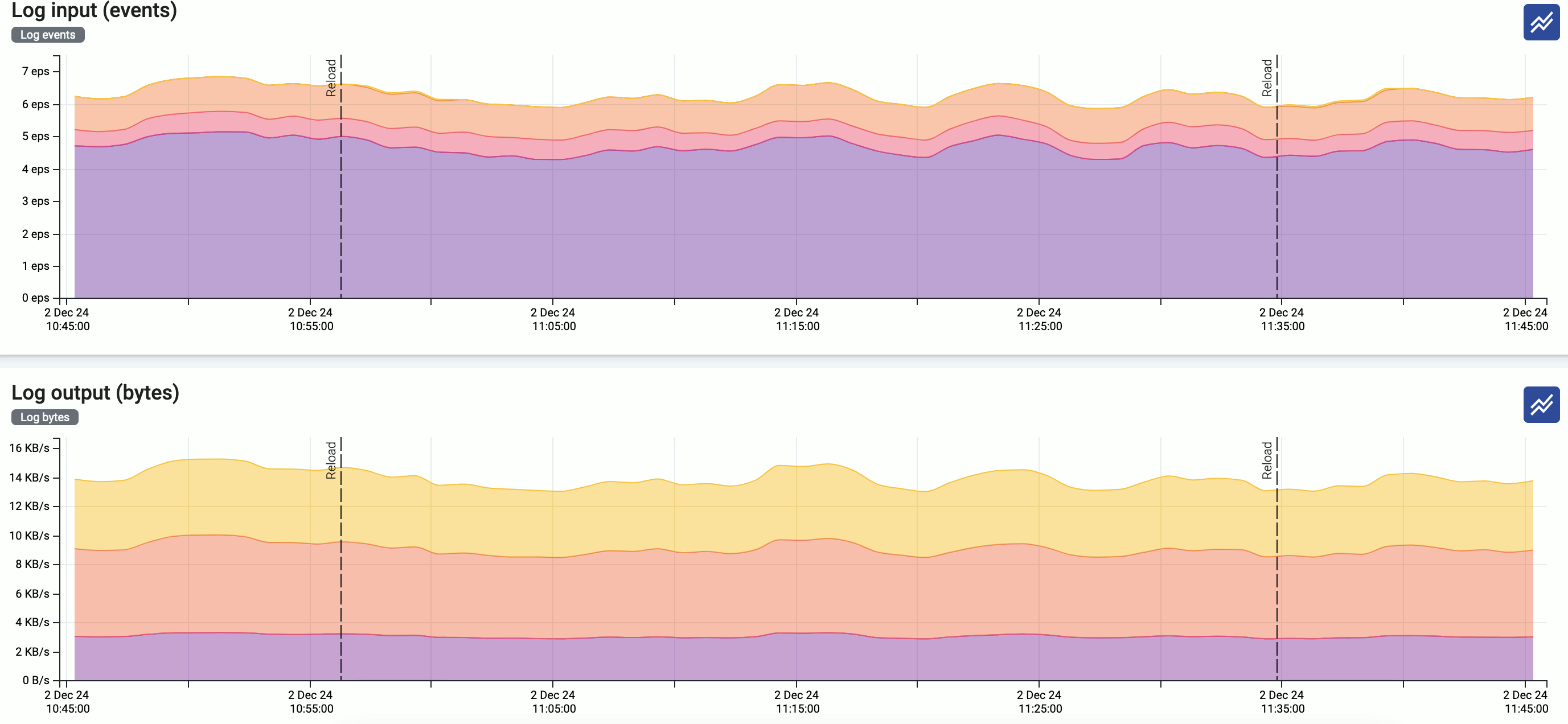
Log input (bytes): Incoming log messages processed by each connector, measured in bytes per second, averaged for a time window of 5 minutes.
-
Log input (events): Number of incoming log messages processed by each connector per second, averaged for a time window of 5 minutes.
-
Log output (bytes): Log messages sent to each log destination, measured in bytes per second, averaged for a time window of 5 minutes.
-
Log output (events): Number of log messages sent to each log destination per second, averaged for a time window of 5 minutes.
-
Log memory queue (bytes): Total bytes of data waiting in each memory queue.
-
Log memory queue (events): Number of messages waiting in each memory queue by destination.
-
Log disk queue (bytes): This chart shows the following metrics about disk queue usage:
- Disk queue bytes: Total bytes of data waiting in each disk queue.
- Disk queue memory cache bytes: Amount of memory used for caching disk-based queues.
-
Log disk queue (events): Number of messages waiting in each disk queue by destination.
-
Memory: Memory usage and capacity reported by the OS in bytes (including reclaimable caches and buffers).
-
Network input (bytes): Incoming network traffic in bytes/second reported by the OS for each network interface averaged within a time window of 5 minutes.
-
Network input (packets): Number of incoming network packets per second reported by the OS for each network interface averaged within a time window of 5 minutes.
-
Network output (bytes): Outgoing network traffic in bytes/second reported by the OS for each network interface averaged within a time window of 5 minutes.
-
Network output (packets): Number of outgoing network packets per second reported by the OS for each network interface averaged within a time window of 5 minutes.
-
Event delay (seconds): Latency of outgoing messages.